The project notebook
Restaurant chair finishes: approve the relationships, not just the swatch
A chair finish is seen beside other surfaces. The floor frames the legs, the table sits close to the seat and back, and the room's lighting changes how the combination appears. Approving a swatch in isolation can miss the relationship that actually defines the dining room.
Start by deciding which relationships should repeat. The frame might echo a dark table base while the seat introduces a contrasting color. Or several chair shapes may share one material reference. A clear palette brief helps the buyer distinguish an intentional difference from an accidental mismatch before the quantity is multiplied.
Open diagram at full size (new tab) ↗
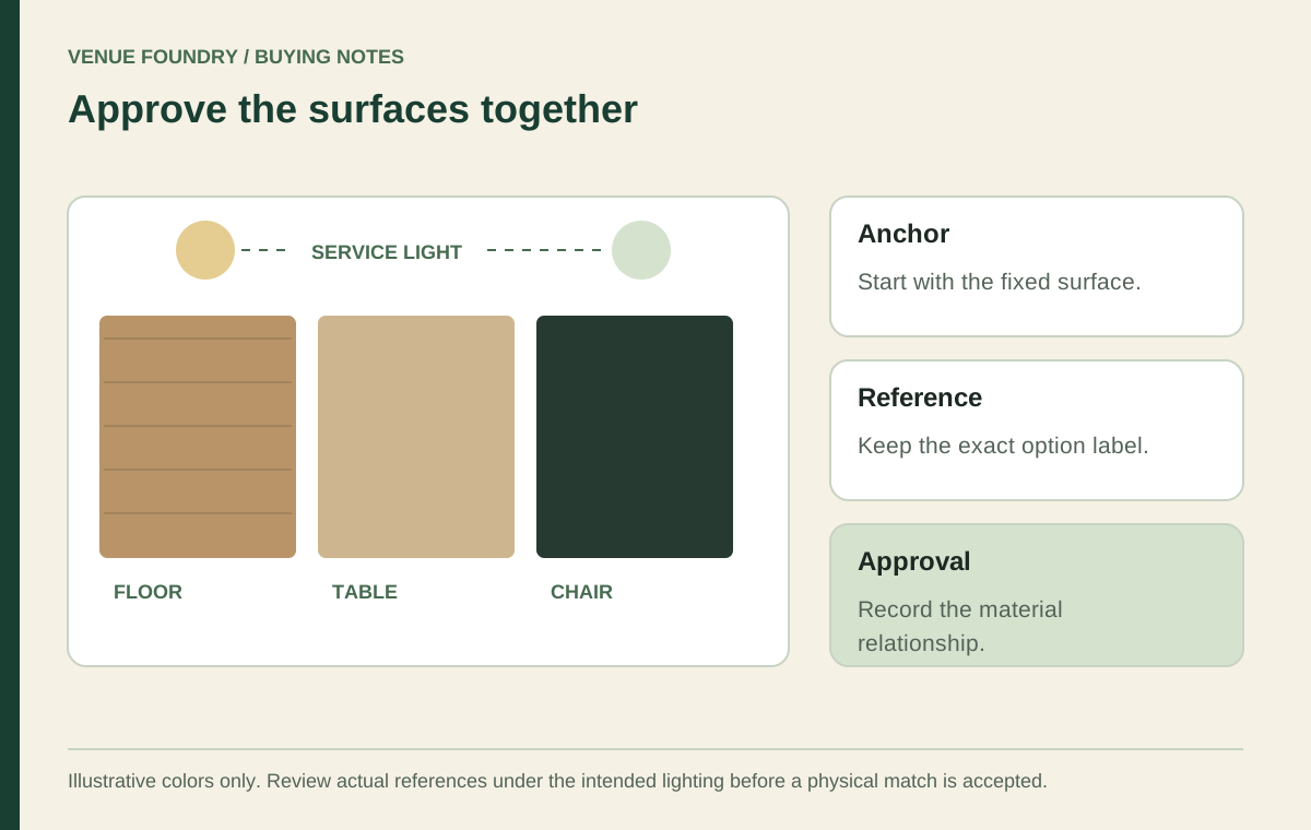
Choose an anchor surface for the first comparison
Identify the surface that is least likely to change. It may be an existing floor, a selected tabletop, or a built-in counter. Record its reference and bring the proposed chair finish into that context rather than comparing disconnected digital images.
Browse restaurant chairs with the room's actual materials in mind. Look at the frame, seat, and back as separate visible elements. A chair can connect to the palette through one of those elements without matching every surrounding surface.
Read the materials guide before comparing the selected option labels, and retain those labels in the actual product records. A descriptive name is helpful identification, but it is not a color measurement. Two products called Black can still need a physical comparison if the project requires a close match.
Compare the substrate as well as the color name
The October 17, 2026 record for chair FRU-401070 lists a wood frame and a Black frame color. The FRU-478-120 chair lists a metal frame in Black with a Black vinyl seat. Those records share color wording while describing different materials and visible surfaces.
Treat that as a design choice to review, not an automatic mismatch or guaranteed match. Look at the actual references together. Surface character, the amount of each material visible, and the chair's outline can affect the composition even when the palette uses only a few colors.
The mixed-chair style guide explores how a shared finish can connect different silhouettes. A consistent color direction can help organize the room, but it should not erase the separate product options needed to order each piece.
Review the palette under the intended lighting
Natural and artificial light can change the appearance of a color, and surface finish affects how light is reflected. That is a reason to review actual references in the proposed room conditions. It is not a reason to promise that a screen image predicts the result.
Compare the selected sample beside the anchor surface under the lighting used during service. If the venue operates in daylight and after dark, review both conditions where the project requires that comparison. Record the setup and the decision rather than relying on a photograph taken under unknown lighting.
Label the physical references before the session. Similar samples can become difficult to identify after they have been moved between rooms. Retain the model, offered option name, and sample reference together, and note which side or orientation was reviewed when that affects the visible material. This gives a later discussion a specific object to return to.
Keep the observation specific. A reviewer can say that the chosen combination was accepted in the stated setting. That does not establish an exact match in every room, on every display, or under a future lighting change.
Bring the tabletop and support into the palette
The table presents a large adjacent surface, while the base may be visible between chairs. Review the chosen tabletop and base together with the chair. Their physical compatibility remains a separate check from the finish relationship.
The table system guide helps keep those two reviews distinct. A palette approval does not establish that an unrelated base supports a particular top. Equally, a confirmed component pairing does not mean its visible finish is right for the room concept.
If the selection uses a complete table, retain the exact offered size and color controls in the record. A different product photograph may show a representative configuration. The selected labels should explain which version belongs to the approved palette.
Use contrast deliberately rather than treating it as a defect
The team may prefer a clear contrast between chair and floor so the furniture outline remains visually distinct. Another scheme may repeat related tones for a quieter composition. These are design judgments to review with actual references, not universal rules that every restaurant should follow.
Define where the variation belongs. A contrasting seat color can be repeated across the room, or one zone can use a different chair family while retaining a shared frame reference. Limit the number of unexplained changes so a reviewer can describe the organizing idea.
The venue-type guide can help connect the palette to different service areas. A cafe counter, private dining room, and patio need not look identical. Their relationship should be intentional, with outdoor selections retaining their own documented use requirements.
Turn the visual decision into a configured record
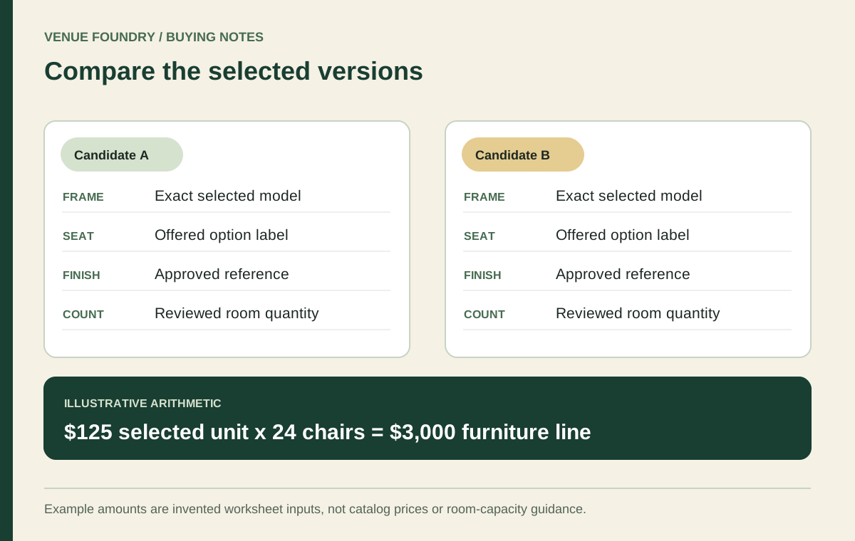
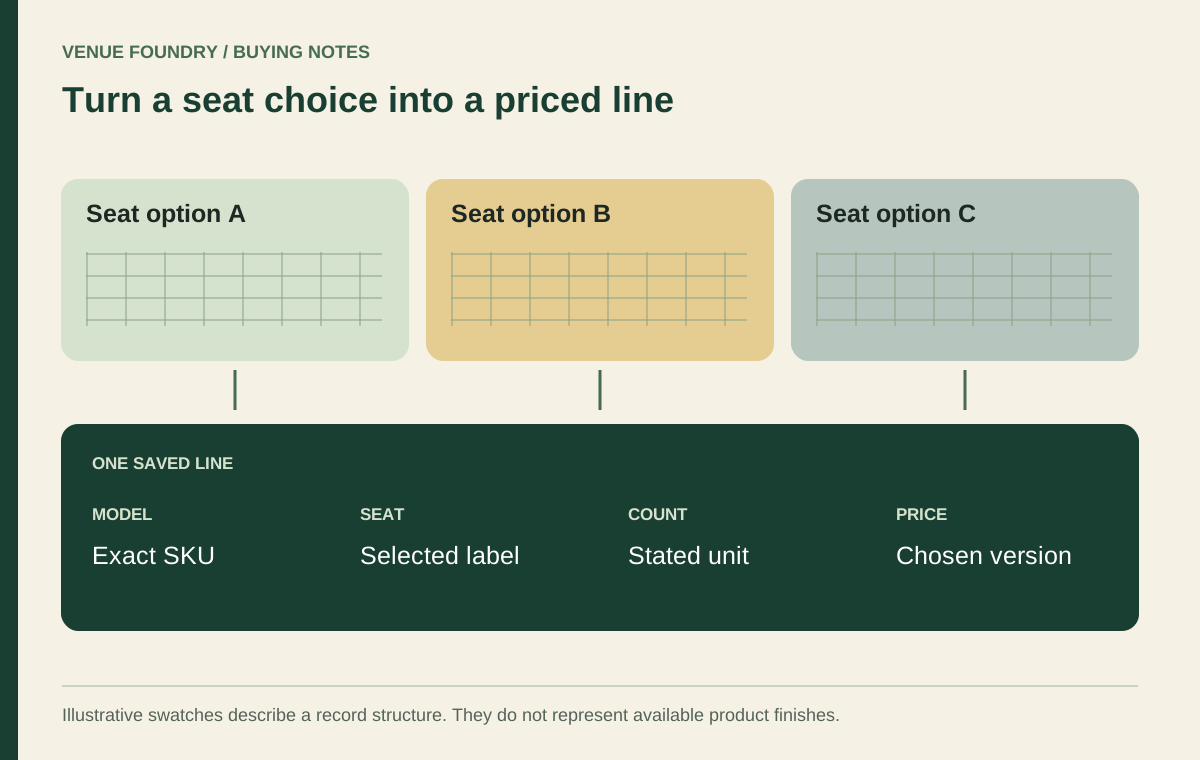
Save each accepted version to the budget planner. Keep different finishes on separate lines, even when the model number is the same. The quantity then belongs to one identifiable selection and the price reflects that configuration.
Record these three references before the order review:
- The exact product option label and any physical sample identification.
- The adjacent surface and lighting conditions used for approval.
- The room or zone receiving that configuration and its reviewed quantity.
The upholstered-chair guide explains why a note cannot replace a selected seat option. A phrase such as the darker one is particularly weak when several swatches have been discussed. Use the actual label and retain the approved reference.
Keep the palette decision through the final price review
Review current options before transferring the selected lines to the basket. If a finish changes, revisit the affected material approval. A similar-looking replacement should not inherit a sign-off simply because it fits the same budget.
The final schedule should connect the visual idea to the exact selections. The floor, chair, and table can form a considered composition, while each product still has a clear option record. That lets the room keep its design intent without asking the order reviewer to translate memory, photographs, or informal color names into a purchase.